Course Archive

This site contains student blog posts and teaching materials related to MALS 78100: The Digital Humanities in Research and Teaching, which was co-taught at the CUNY Graduate Center in Spring 2012 by Profs. Stephen Brier and Matthew K. Gold. We will leave the content of the site available as a record of our class and a resource for others who might be interested in the topics we covered. Please contact us if you have any questions about the material that appears on the site.

Posted in Uncategorized | Comments Off on Course Archive

To all our “excitement” my American Idol twitter stats are panning out!

This gallery contains 3 photos.

I know everyone has been sitting at the edge of their chairs waiting for our new American Idol (sarcasm) so I decided to upload the twitter stats of the last three finalists.  The stats successfully predicted the person who was … Continue reading

More Galleries | Comments Off on To all our “excitement” my American Idol twitter stats are panning out!

DH Project at Brooklyn Museum

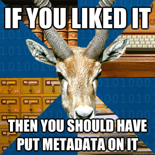
Just wanted to share a DH project I ran across, and some thoughts on the actual implementation. At the Brooklyn Museum they have a smart phone game. You are given a list of words to pick from (flower, horse, blue, water, and so on). As you go through the gallery you find pieces that are associated with your word, type in the item serial number into the app, and get points. Enough points would win you a prize. I thought this was a clever way to crowdsource meta-data tagging for their collection which could otherwise be prohibitively expensive. I found the program too cumbersome to use, but the kids in my group were crazy about  it.

Pluses

making it a “game” with points and prizes made people far more interested than presenting it as “let’s meta-data tag this collection for the museum”

Captured small amount of work. People could tag one item and be useful, or could capture many.

Multiple people could work on the same tag, which would allow you some measure of statistical confidence as you assigned official tags

Minuses

User interface was hard to use. You had to type in the museum code for each item which was something like “1998.230-MY332s c20” and it had to match exactly. It should have had optical character recognition or barcodes that you could scan.

Would have liked to have some concept of teams, and the ability to link people or teams together. Everyone kept wanting to compare their scores, and the youngest kids were at a huge disadvantage.

Didn’t offer any additional enrichment. Not that the kids playing cared, but if your item was “flower” and you were in the islamic art section, it would have been nice to learn a little bit more about what flowers represented in that artistic style and the reasons that they were used.

 

Posted in Uncategorized | Tagged | Comments Off on DH Project at Brooklyn Museum

mapping visually

Lima’s book is an absolutely new experience for me; even though I took a class in critical mapping last semester and we did cover unique, weird, and radical maps, somehow the scope was a lot more restricted than in Lima’s book. This book is eye-opening in the sense that it makes one think about data, not just in the confined context of the research, but more about its abundance in the mundane life. Yes, data is everywhere, we are data and we produce data every single nanosecond, but, maybe to preserve our sanity, we try to categorize and evaluate it depending on our research question. Approaching all data as equally important is made possible thanks to the new technology and developing tools to work with it, so that we can explore what is really there, rather than unconsciously collect only the part of the data that supports our claims is fascinating. The words that jumped at me in the last chapter were “diversity,” “multiplicity” and “the future of visualization.” There is no need for controlled use of the information. “Citizen science,” a concept that enables every citizen to become part of the solutions to the problems in his neighborhood or community, is as optimistic as it is far removed from reality. I tried to take pictures of the inside of the GC building last semester so that I could build a map for my class and I was told point blank that I wasn’t allowed to, unless I had permission from the department. Apparently, not all spaces are free to film or take pictures of and I would imagine that there are valid reasons why we want to control access to certain kinds of information; some of those reasons could be for security, privacy, and you also want to make sure that there is an ethical consideration in the use of that information. Information can be manipulated for selfish reasons, either by particular individuals to further their agenda, or by governments or agencies to further their interests. I could appreciate the optimism with which the possibilities of access to limitless data are heralded, but I’m also skeptical, because there is a precedent of new, harmless inventions becoming lethal (nuclear power for one). Nonetheless, I am  as excited as Yau is about the possibilities that access to data opens up, especially for neighborhoods. “Visualization is as good as the data that creates it, and if there is no data, there is nothing to analyze—no new understanding of the world.” It’s important to develop tools to help map the data, but it’s equally important to find ways to facilitate data gathering. Crowdsourcing data is so helpful, especially when it comes to covering a large area or a number of communities. It’s probably better to rely on the members of the community to do the data gathering because they will know better where to look and what to watch out for, besides the fact that they are invested in the idea that it’s for the improvement of their own community.

Posted in Uncategorized | Comments Off on mapping visually

GeoCommons

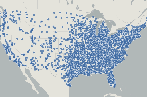
One of the geospatial tools I tried was GeoCommons. I really like the maps featured on GeoCommons because visualizing data can really add to your overall understanding of the information. For example everyone knows what a retail behemoth Wal-Mart is but seeing the map of it was nonetheless shocking:

Opening dates of Wal-Mart stores and Supercenters, 1962-Jan 31, 2006 (Alaska and Hawaii excluded)

I had a lot of difficulty in trying to create a map with my own data set. Every time I tried to upload my excel document saved in CSV it kept saying error. I wanted to create a map of of the places I go to most often but it just wasn’t working. They have data sets available on the website, but I don’t understand what I would do with other people’s data sets since turning it into a map won’t change much, the map feature just allows you to change colors, lines, etc. basically the aesthetics of the map. Other people’s data would only come in handy if it complimented my own, and I could show both on one map. I will post again if I figure out why my data isn’t uploading.

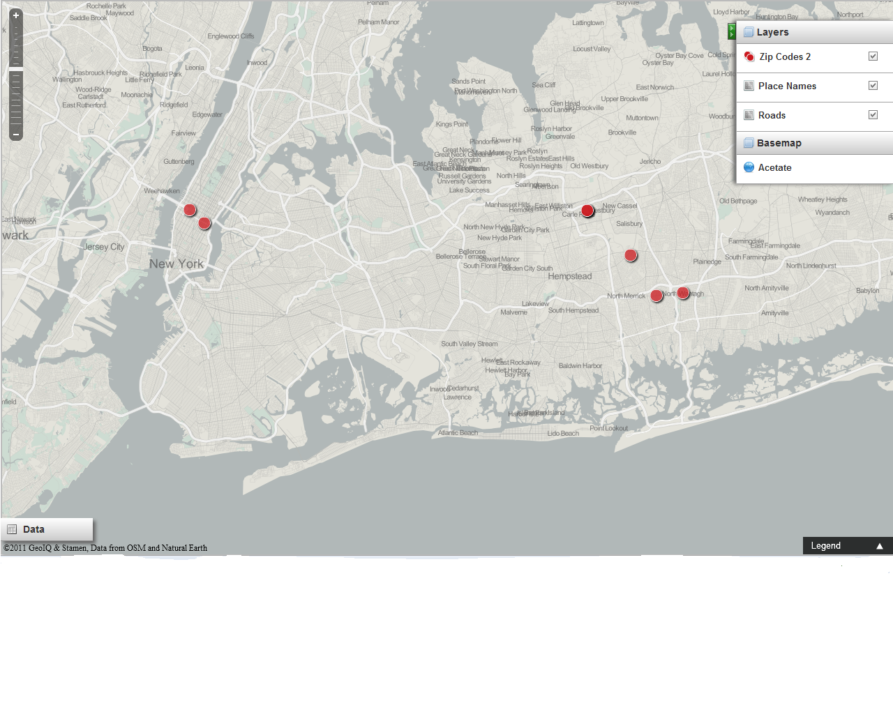
Update: So I did get it to work when I tried again and it was fairly simple except you have to read the instructions which is something I’m not used to. I really enjoyed Steve Romalewski’s visit to our class last week because his presentation illustrated the unique and interesting possibilities of GIS tools. The following is a map of my most frequented zip codes, although it’s not unique or interesting, creating it made me get enough of a sense of the tool to be able to create something better next time…

Posted in Uncategorized | 3 Comments

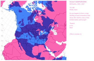
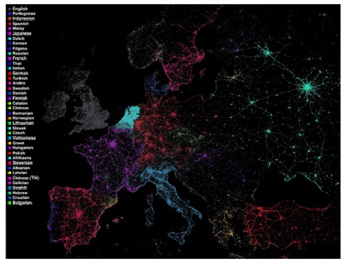
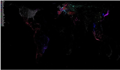
As we are discussing visualizing information and tools, I didn’t want to write a long blog post with words. So I decided to share some interesting maps I found and a couple of good project that are going on right now and deal with geospatial tools and mapping. Please check them out.

The Spatial History Project from Stanford University. Their projects “operate outside of normal historical practice in five ways: they are collaborative, use visualization, depend on the use of computers, are open-ended, and have a conceptual focus on space”. They use visualization not as a tool but as a research method. http://www.stanford.edu/group/spatialhistory/cgi-bin/site/index.php  

Visualizing Emancipation from the University of Richmond and the Office of Digital Humanities at the National Endowment for the Humanities http://dsl.richmond.edu/emancipation/

Maps from:

Bill Rankin’s Radical Cartography

Language communities of Twitter

Posted in Uncategorized | Comments Off on

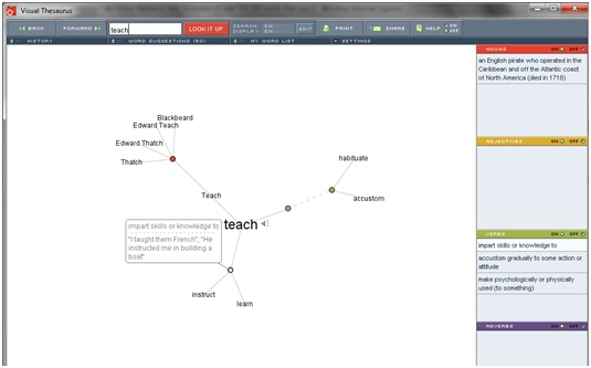
Today I discovered that Thesaurus is using 4 different visual representations tools when you look for a word. I tried Visual Thesaurus and it created and image that combines the classification of the word, its meanings and other words that relate to it. I created this image with the word “Teach”


Posted in Uncategorized | Comments Off on

Steve Romalewski Visits Class Tomorrow

We will be visited tomorrow by Steve Romalewski, director of the CUNY Mapping Service, who is in charge of all mapping projects for the Center for Urban Research at GC (see the following link to get an overview of his and CUR’s work in this area). Steve will talk about the various uses of GIS in dvarious digital and mapping projects. He suggests that we take a look at their newest initiative, which is to make the newly released 1940 U.S. Census manuscripts accessible for use by the public. Steve will visit with us in the first hour of the class.

Posted in Uncategorized | Comments Off on Steve Romalewski Visits Class Tomorrow

Playing with Tools: Timelines

I’m someone who can never keep dates straight. I have to contextualize events in order to remember when they happened. As we’ve been talking about the history of mapping, visualizations and trees, I’ve also been thinking about timelines and how they fit into our conversations and map information–perhaps in ways that might help me to visualize and remember events in relation to one another.

I also recently discovered the book Cartographies of Time: A History of the Timeline (which I can bring to class), which reminds me a bit of the first chapter of Lima’s book exploring the history of tree visualizations.

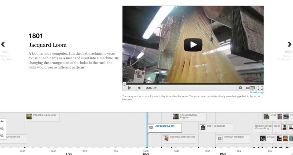
Searched Bamboo DiRT, found a few timeline tools that looked interesting: a new project that hasn’t yet launched called Time Flow. And another tool called Timeline, which makes really nice looking timelines, with embedded videos and image capabilities–so I decided to try to play around with it a bit.

Timeline gives the option to download or to place the information that you want in your timeline in a Google Doc (by entering all the data in a spreadsheet, publishing the spreadsheet, and using the link as html that could be used to put the information on a website). Both options were pretty confusing for me, and perhaps compacting the issue is that I don’t necessarily have an already-written timeline to use to experiment with.

However, the code is open and the developers seem happy to get feedback. My first suggestion would be to create more documentation that walks all folks through the process of using the tool (!). I’m going to do a bit more investigating and see what else I can find or accomplish.

Posted in Uncategorized | Tagged , | 2 Comments