Visualizations Trapped behind Glass?

I’ve been noticing various visualizations around me on the web constantly since we started discussing them in class. Since we’ve begun talking about visual representations, I haven’t even been able to keep track of all of the things that have run past my screens that seemed relevant.

When I think about reading chapter 4, “Infinite Interconnectedness” of Lima’s Visual Complexity, I compare the experience of looking a printed book to being able to explore a visualization online. In this chapter, Lima presents a portfolio of network visualization projects that tracked a variety of data sets, from blog activity to terrorist cells.

Lima mentions the Digital Dark Age in his introduction, and how he found it easier to gain access to a 12th century illustration than a visualization produced in 2001. So I understand that this book, or this chapter, may in many ways be an attempt to archival snapshot of visualization work. However, as I examined chapter 4, I kept wondering why one would produce this kind of object–essentially a collection of photographs, or two-dimensional fixed images in print of these visualizations that otherwise would contain, display and make available much more information in whatever form these visualizations were originally released–on the web, etc. To me looking at this chapter felt a bit like seeing a still from a film: when you haven’t seen the full feature, you just can’t grasp the whole thing from one image alone. I really wanted to be able to view these objects both closely and from afar, in ways that I think would have been more manipulate-able online.* If visualizations are tools, then would seeing a photo of a hammer or a paintbrush really give you the sense of the full spectrum of its abilities?

I really liked Maureen Stone’s piece, “Information Visualization: Challenge for the Humanities,” in relation to examining the chapters of Lima’s book that were portfolio-like. Stone writes a bit about the history of visualization and also its key elements: color, and the materials that make up visualizations (i.e. paper, screens, etc.). Stone talks about the way that reproduction on an offset press affected map making. Acknowledging that map makers were influenced by the methods through which their maps were printed  is not something that we’ve talked about in class when we looked at printed maps–but understanding how these items were constructed, from concept to the page, might assist our understanding of what these items are and all the hands that helped them come into being. I think the same is true for born-digital works: understanding how they are constructed can aid our appreciation of their form.

Talking more about color and construction of visualizations as printed objects, software, jpegs, or apps also pokes at the underbelly of materiality in all of these visualizations, and my qualms with Lima’s book–how could his representations of each project really capture the piece effectively, when such a radical transformation happens from morphable pixels to the page? Isn’t this book merely presenting a snapshot, or a tiny portion of each piece?

I’m interested in what you all thought as you were reading and viewing Lima’s work: can a printed book really capture the essence of these three dimensional visualizations, and if not, why might this book still be important?

*I know Lima also has an accompanying website–I wonder if how this might have been used or promoted differently in the book?

Posted in Uncategorized | Tagged , , , | Comments Off on Visualizations Trapped behind Glass?

Data Mining One’s Own Life

Fascinating article on data mining one’s own email/phone calls/keystrokes in today’s NY Times, focused on Dr. Stephen Wolfram, “a scientist and entrepreneur,” who has stored all of his personal electronic data since 1989. He decided to test out on of his company’s new data mining tools to find patterns in his behavior. The article’s accompanying graphs (hardly network visualizations, but still fairly interesting) tell the tale, such as it is.

http://www.nytimes.com/2012/04/08/business/mining-our-personal-data-for-our-own-good.html?_r=1&nl=todaysheadlines&emc=edit_th_20120408

I’m not sure how interesting his questions are, but this piece is at least suggestive.

Posted in Uncategorized | Tagged , | 1 Comment

Visualization Tools: Many Eyes

After having tried some of the visualization tools on Bamboo DiRT, I found Many Eyes to be the most fun.  Many Eyes lets you visualize any data you enter into its system through graphs, charts, trees, etc. It’s similar to the tools we used last week but it offers 21 different types of tools to use all in one place. To get a sense of how to use it, I took a random data set from the US Census Bureau and entered it into the program. Here is a pie chart of my data:

(Link)

This is a simple visualization of population by race in New York. The more complicated the data, the more interesting the results will be. Also, Many Eyes is a community site where you can use and expand other people’s data and visualizations as well as post your own. There are so many ways to use this tool when doing or presenting research.

I thought it would be interesting to enter our syllabus in as a data set and see the kinds of graphs that would turn up. I entered the words “Digital Humanities” into a word tree of our syllabus, here is the result:

(Link)

Or a tag cloud:

(Link)

Posted in Uncategorized | 3 Comments

From Trees to Networks

In the second chapter of Lima’s book he talked about how trees have been used to show hierarchy, neatness, and order when in reality nothing is a simply connected as trees portray. He discusses criticisms and alternative formats to trees and the need to show the interweaving traits which are better represented by networks. He cites Guillaume Lecointre and Herve Le Guyader’s book The Tree of Life and their additional views associated with trees: finalism and essentialism. The argument is that trees are static. They do not show change over time, which is eventually what Darwin began to represent with his trees, change over time.

Lima introduces the term Rhizome which was also proposed by Lecointre and Guyader is a way to complicate trees. It connects any point to any other point which allows for intercommunicability. In a way this fuses maps and trees. He argues that this concept has has a major influence on the fields of communication theory, cyberspace theory, complex systems, nonlinear narratives, and hypermedia (44).

He next discusses rhizomatic theory in the context of city planning, mapping the brain, understanding complex dataspheres, ordering nature, and all forms of classification. Each section is another look at his main thesis that in the past we have oversimplified how we categorize information. The emergence of the internet has created an even larger space to experiment with the theory of networks and how they are connected. Computers have opened up a plethora of opportunities to reexamine complex systems such as the brain. He mentions the Blue Brain project being conducted at Ecole Polytechnique Federale de Lausanne (a university in Switzerland) in which a holistic model of the intricate structure of the brain is being mapped. He equates the complexity and greatness of this project to the Human Genome Project.

If we look at the image that I included, which is a map of science constructed by sorting scientific papers into paradigms. The colors circles show which authors were more frequently cited. I’m not sure how well you can see the image but in the book it is almost impossible to have any idea what the subject matter of this picture is without a caption. Even with the caption I was unable to read any of the font or figure out who the authors were that were included. I found this to be the case with a lot of the images in the text. The data seemed inaccessible because of its complexity. This may be a case of trying to put something that works better digitally into print. On a computer I may be able to zoom into the picture to see the names and connections but at least in print, I had no idea what any of the images were really trying to portray other than connections.

Posted in Uncategorized | 1 Comment

Visual Complexity

Visual Complexity

Introduction and Chapter 1

Manuel Lima starts his book introduction describing how he started his research. During his MFA he became interested in visual representation of networks, taking the blogosphere as the “laboratory to track and analyze how trends, ideas, and information travel through different online social groups” (Lima, 15). As his research progressed, he realized that the “network” as a structure is present in most systems, from the brain to the website.

In 2005 he launched his online site call Visual Complexity, with the goal of “facilitate a critical understanding to different network- visualization methods across the widest spectrum of knowledge.” (Lima, 16) Please take a look of the site; it has thousands of different projects of network representations as well as blog posts and a statistics section that show percentages of the most popular subjects, most research keywords, etc.  http://www.visualcomplexity.com


Also in the introduction the author mention the problem of the temporary lifespan of most online visualizations. There are several reasons for that: authors don’t update codes, differences in formats or the application programming interface (API), domains taken down from servers, etc.   In his book, Lima also wants to preserve and be a source of information for next generations of material that may disappear from the web in the near future.

I think that this point is extremely important for the Digital Humanities, as we had talked in class of the different formats and coding changing trough time, here we have an example of the need of preservation. How the author does that? Taking the digital to paper.

The book combines 2 disciplines: network science and information visualization. Lima says that network science “examines the interconnection” of various systems and information visualization “visually translate” data. It’s extremely important to recognize the interaction of different disciplines in the creation of information visualization, and the use of visual tools to TRANSLATE… to create something new.

The first chapter of the book focuses on the history of trees as system of representation and organizers usually highlighting a hierarchical order. The author mentions the meaning of trees and the various representations trough history.

He starts with the Sacred Trees and the three of life. Those representations are present in most religions and cultures; from the Garden of Eden to the Sephirotic tree in the Jewish tradition of Kabbalah. He continues with the Trees of Knowledge, explaining that because of its metaphorical structure it has been use for thousands of years to explain, classify and organize. For its shape, it helps to illustrate relationships: multiplicity and unity. Threes become then a common know tool for two major domains: genealogy and classification.

If we focus on the images that the author present as examples of the evolution of the use of trees as representation and organization tools we can fall in two readings. We may tend to simplify its meaning from only looking at the beautiful images and reading the nice story. We can focus on the aesthetic aspect, and see that many of them were done on animal skins, using elaborated fonts and images with a lot of detail on the use of symbols and color. Also we can think on what information is display in there, what are the words, what are the connections. That could be a good start, but for me the most important thing is to see those representations in their context. I think that the author doesn’t make enough emphasis on why those trees are important thru history. The key is the level of abstraction that a person needs to have to be able to use a visual image that maybe nothing has to deal with what you are representing.

Lima mentions the evolution of classification, from Aristotle to the Tree of Porphry, the Book of figures and the Tree of Science in the medieval era. Later on the chapter under the title of The consolidation: Francis Bacon and Rene Descartes, he describes the collaboration of the philosophers and how they used the classification, categories and divisions to explain their thoughts. Both Bacon and Descartes used the image of trees as a metaphor for Philosophy. But neither of them developed an actual visual image of the tree of knowledge. In 1728 Ephraim Chambers published Cyclopaedia, one of the first encyclopedias in English. One of his biggest visual contribution was the introduction of a horizontal tree diagram witch in hierarchal order is read from left to right.

By the middle of the eighteen century, Denis Diderot and Jean le Rond d’ Alembert published the Encyclopedie inspired in Chambers work. Diderot explained, “Thanks to the encyclopedic ordering, the universality of knowledge, and the frequency of references … we perceive either continuity or the gaps in our system, its weak sides, its strong points, and at a glance on which objects it is important to work for one’s own glory, or for the greater utility to humankind…” (Lima, 39). 

Lima ends his chapter mentioning that through time tree diagrams have transformed and have gain a “generic nonfigurative design” becoming practical tools but still using the labels of the past: root, branches and leaves.

Posted in Uncategorized | 1 Comment

Decoding Networks

I’ll preface this post by saying that even after reading Manuel Lima’s immensely readable chapter introducing networks in Visual Complexity, I am not entirely certain that I understand the purpose of most network visualizations. On second thought, perhaps I don’t understand the outcome of most network visualizations.  But before I get into that, let’s take a look at what Lima has to say about them.

What is a network?

Components of a Network

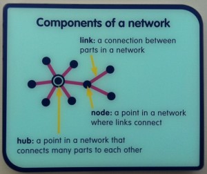
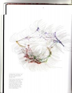
"Components of a Network," exhibit label at the New York Hall of Science

A network is a structural and organizational model of natural or artificial systems that is characterized by “a multitude of interconnecting elements” (73). Lima reviews the origins of network science, from graph theory and statistical mapping to sociometry (later known as “social network analysis” within sociology). Today most network representation takes the form of either graph drawing as part of graph theory, or network visualization as part of information visualization.  Both use graphs to show a system of nodes (or vertices) and links (or edges). In network visualization, however, there is an emphasis on visual design principles to convey meaning that exceeds the sort of geometric representation one would find in graph theory.  By examining the various nodes and links one can glean information about the network as a whole.

Network visualization can be a remarkable discovery tool, able to translate structural complexity into perceptible visual insights aimed at a clearer understanding. It is through its pictorial representation and interactive analysis that modern network visualization gives life to many structures hidden from human perception, providing us with an original “map” of the territory. (79)

Indeed, Lima spends considerable time drawing connections between network visualization and cartography, noting their shared goals: simplifying, clarifying, communicating, exploring, recording, and supporting. If cartography is an abstraction of the physical terrain, network visualization maps the invisible.  Lima believes that the latter should learn from the former how to successfully combine science, aesthetics, and technique.

Why visualize networks?

We visualize information to decode complexity. Lima lists five functions of network visualization: document, clarify, reveal, expand, abstract. As noted above, network visualizations—when done well—act as discovery tools, revealing new insight or hidden patterns. Lima laments the lack of real principles for successful visualization, noting that in 1914 Willard Brinton attempted 25 rules for graphic representation that have yet to be expanded or embraced. He then provides his own eight principles for network visualization projects which I will summarize briefly here.

8 Principles for Network Visualization Projects

1.  Start with a question. Throughout the project this will provide “a measure for naturally filtering the essential from the superfluous” (82).

2. Look for relevancy. The two key activities where this applies: choosing a data set and selecting a visualization method.

3. Enable multivariate analysis. This simply means to consider a variety of multiple data sets that will enrich the depth of analysis.

4. Embrace time. That is, represent time in your visualization. Lima acknowledges that this is very difficult to do, noting that it is often avoided due to its complexity.

5. Enrich your vocabulary. Here Lima gives three points: make richer nodes (provide further textual information or hyperlinks in them); expressive edges (consider using length, width, color, shape, to represent information); clear visual language (e.g., use a legend, like maps do).

6. Expose grouping. Use spacial arrangement to draw attention to relationships.  Drawing on psychology, Lima suggests designing visualizations based on three of the six Gestalt laws of grouping: similarity, proximity, common fate.

7. Maximize scaling. There are three views a network visualization can take, and Lima suggests making use of all three: macro view (reveals pattern), relationship view (shows connectivity), and micro view (depicts entities).

8. Managing intricacy. Utilize the idea of progressive disclosure, as do digital maps. Lima discusses a series of interaction design techniques: adaptive zooming (think zooming in on Google maps), overview and detail (an inset macro view on the zoomed view), focus and context (a fish-eye view that allows a zoomed area to bubble up from the remaining macro view).

Challenges for visualization

Throughout the chapter, Lima makes the case for incorporating design elements to enhance clarity and improve the manner in which the network structure is communicated to the end-user. It is not enough to build something that can manage the information; it must be usefully displayed to convey meaning.  He ends with a plea for interdisciplinary design:

In order for the general usability of network visualization to improve, we need to embrace the existing body of knowledge from graphic design, cartography, and visual perception, including notions of color theory, composition, typography, layout, and spatial arrangement. (95)

On understanding network visualizations

Back to my initial problem: why can’t I make sense of most network visualizations? Leafing through Lima’s book, or exploring the visualizations on the accompanying website, I am struck by their aesthetic beauty. They are gorgeous. I want to understand them. Why can’t I?

Two clues to my predicament are found in Lima’s introduction to networks.  First is his call for visualizations to include an explanatory legend, in which he cautions to “beware of creating a visual language that might not be immediately recognized by everyone” (88). Second is his discussion on scaling (in Principle #7), which compares the macro view, relationship view, and micro view. He explains that the primary function of the macro view is synthesis, whereas the relationship view “is about analytics” (92). I think my problem is that I want to see the analytics, but instead I am looking at the synthesis.

Going back to the comparison with cartography, let me think about my own use of maps. Yes, they are pretty. I like to hang them on my walls. If I try to navigate unfamiliar territory using them, they certainly help. Yet they are most useful to me after I’ve explored an area by foot. Visualizing the street layout synthesizes my experience of the neighborhood and I emerge with a greater understanding of the area. This is not to say that the macro view of network visualization cannot convey meaning to me. Rather, I think I would have a better experience with them if I were first presented with detail and then allowed to zoom out to the bigger picture.

This brings me, then, to the discussion in DH of building as theory and whether or not DH projects could stand alone as scholarship for promotion and tenure (without the need for a written accompaniment). When it comes to network visualizations, I can absolutely see how the process of building advances knowledge and can be construed as the theory itself. Yet my own difficulty in reading them makes me wary of disposing entirely of that written explanation. I leave open for discussion whether or not this is a failure in usability or simply ignorance on my part.

Posted in Uncategorized | 3 Comments

Wordle vs Voyant: Can they be used in teaching? Yes!

I decided to return to Voyant and add a little Wordle into the mix. At first I thought it was ambiguous whether or  not these tools were applicable to much more than entertainment, or brainstorming.  Jill mentioned using these programs for student praise and to motivate participation which could be handy I suppose.  I wanted more perspectives so I did a search on “reasons to use Wordle” and sifted through the results. I landed on an article from a teacher in the U.K. whom wrote an article named “Five Reasons to use Wordle in Teaching” by Terrie Freedman. I believe he explains some compelling uses for word clouds with young people and for teachers working under the increasing restrictions placed on teaching to standardized tests.  He says he uses the tool for summarizing and self-reflection and argues it can be seen as an alternative to bullet points, yet it’s a more  creative and visually pleasing option.

Read more about the uses in teaching here: http://www.techlearning.com/default.aspx?tabid=67&entryid=209

A difference I noted in Wordle was that it already removed “stop words” and allowed for a variation of color, background, layouts and fonts. Voyant allowed for specific word edits as Roxanne pointed out in class.

Posted in Uncategorized | 3 Comments

Political word fun with Ngram

Capitalism, socialism, communism, libertarian, egalitarian were the first words I decided to do my search on this morning. Besides having a little fun we have agreed some conclusions could be drawn from looking at the highs and lows.  Take for instance libertarian and egalitarian which started to rise slightly in the 50’s and gained momentum thereafter.  We could look at this in terms of first wave feminism or civil rights movement and what the rhetoric was like in literature.

The next search I did included several European dictators and I searched the same names in English, German, Russian and Spanish.  There were some obvious spikes in the charts and some not so obvious.  I hope I don’t offend anyone by posting the dictators, I kept the jpegs small for that one.

Posted in Uncategorized | Comments Off on Political word fun with Ngram

NGram is a bit hazy to me

My experience with Google NGram was as thrilling as it was head-scratching. I entered the words epistle and diary to see how the genres have shifted or which has dominated and I’m not too sure that’s what I got. My understanding is that it scans for words but I’m not sure if those words are in the titles of the books or in the body. Either way, it’s still helpful because it is showing how the preference has shifted for one versus the other. Letter writing seems to dominate the beginning of the 19th century, which corresponds with what I know from the historical development and flourishing of the genre and its decline towards the tail end of the 20th century is no surprise. What used to be under the epistle genre of letter writing is now replaced by emails, tweets and facebook, so this leads me to believe that one needs to do some thinking first before using the tool, or during or after entering the data, that could lead to a new realization. I was surprised to see that diaries have become more popular. Again, I’m not sure what this means. Is it fictional diaries, or diaries as autobiography? I was simply surprised to see that they’ve been given a boost.

Posted in Uncategorized | Comments Off on NGram is a bit hazy to me

Voyant Tools rocks

IMO Voyant Tools helps one tear into the text. Yes, it has appealing graphics: both visual representation and color, which made me wonder if there was some meaning imbedded there, which I was neither aware of nor able to figure out.  However, once one peels those layers and looks for functionality, there’s no disappointment. I entered a short text from a letter from Virginia Woolf to Dora Carrington after the death of Lytton Strachey:

“Oh but Carrington we have to live and be ourselves—and I feel it is more for you to live than for any one; because he loved you so, and loved your oddities and the way you have of being yourself. I cant explain it; but it seems to me that as long as you are there, something we loved in Lytton, something of the best part of his life still goes on. But goodness knows, blind as I am, I know all day long, whatever I’m doing, what you’re suffering. And no one can help you.”

There is 1 document in this corpus with a total of 97 words and 66 unique words.

Most frequent words in the corpus: and (5), you (5), i (4), as (3), but (3).

The above is a statistical sum-up of the text, which shows the literary skills of Woolf even in letters (more than 2/3 are words that don’t repeat, which to me is a high vocabulary density). The text is strategically placed in the middle and the little box below lets you choose the word you want to trace in the text and it highlights only that word and all the instances it appears in. That is a very useful tool for anyone, especially someone who writes. It makes one more aware of the choice of words or preferences for certain words. I can see this tool as a way to teach students why it’s important not to repeat content words too much and what words would be acceptable to appear a number of times in the text. This would go well with vocabulary work (Thesaurus). Rather than have them look up words, this would create the immediacy that is necessary to help people become proactive. It allows them to see that there is a problem that needs to be addressed. The graph on the right looks enticing. I still haven’t figured out how to use it, even though I know that you can add a number of words and look at their frequency and interconnectedness in the context. The best feature is that there is a pre-recorded tutorial that explains how to use the tools and it’s a lot more sophisticated than for what I used it. This could be a perfect tool for a dissertation: both working with literary works or student data, especially if you have to come up with categories. You can look up certain words and scan the text for their frequency. The question remains how to use it more efficiently.

Posted in Uncategorized | Comments Off on Voyant Tools rocks