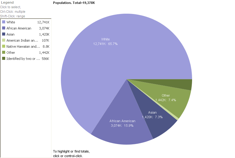
After having tried some of the visualization tools on Bamboo DiRT, I found Many Eyes to be the most fun. Many Eyes lets you visualize any data you enter into its system through graphs, charts, trees, etc. It’s similar to the tools we used last week but it offers 21 different types of tools to use all in one place. To get a sense of how to use it, I took a random data set from the US Census Bureau and entered it into the program. Here is a pie chart of my data:
This is a simple visualization of population by race in New York. The more complicated the data, the more interesting the results will be. Also, Many Eyes is a community site where you can use and expand other people’s data and visualizations as well as post your own. There are so many ways to use this tool when doing or presenting research.
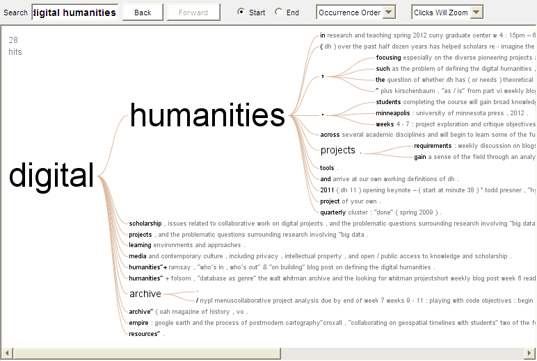
I thought it would be interesting to enter our syllabus in as a data set and see the kinds of graphs that would turn up. I entered the words “Digital Humanities” into a word tree of our syllabus, here is the result:
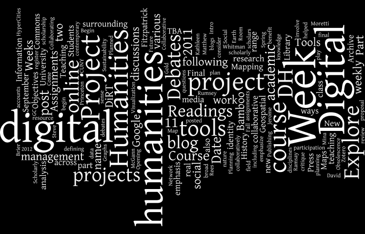
Or a tag cloud:


Thank you Prof. Brier and Alycia!
I really like your idea about using this blog, that would be really interesting to see as well.
Ah–I’m really glad you used our syllabus as a starting point! I had thought about using this very blog to see what words we use vs. perhaps the tags that we mark them with, but this is great–to see our class’ themes represented.
Terrific work, Sameen. Nice uses of Many Eyes.